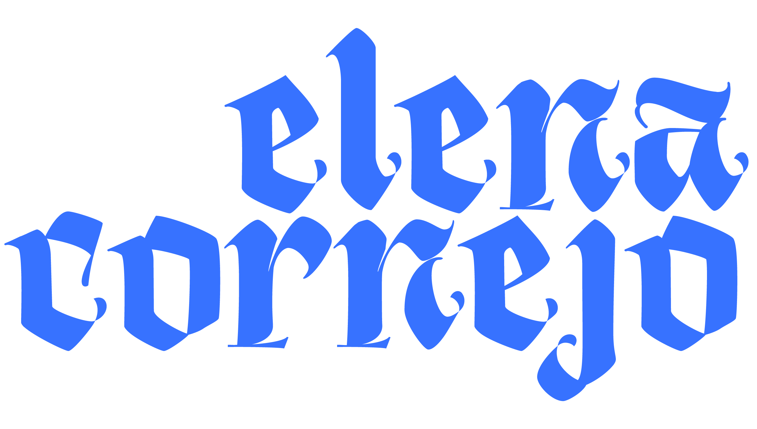
The cover of the type specimen book shows some brush imagery; this showcases the process of creating the font itself. Because the typeface’s biggest design driver was the quirkiness of the Mission San Jose District in Fremont, CA, adding an element of process into the front page of the final book was intentionally ironic and unusual.
This spread showcases the font as a whole including the numbers and symbols. The extra symbol can be interpreted as a plus sign or a cross. Because the big landmark of the area is the actual Mission, I wanted to bring in that element into the font.
This showcases some of the main elements of the typeface, two big elements include asymmetrical stems and irregular cap heights in order to add more quirkiness into the designs.
The vowels in the typeface are all set in lowercase to add to the out-of-place elements in the Mission San Jose area.
This is a quote from the post modern writer, Chuck Palahniuk in his novel, Haunted. The incorporation of this suggests the underlying negative aspects in the neighborhood that only those who live in the area may be aware of.
The process of creating the font can be seen here with the letter ‘R’ as an example. From sketching to inking to first iterations and final. The main component that can be seen throughout most of this iterative process is the use of the asymmetrical stem.
Mission and More was inspired by the architecture and graphic elements found in the neighborhood of the Mission San Jose District in Fremont, CA. It is a hodgepodge of the very old and the very new. Bright sans serifs are used on buildings that date back to the 1940s. The extreme contrast of the dated and the contemporary give a feeling of tackiness. This is what drove the design to be playful and fun.

